Button
Buttons are used to initialize an action. Button labels express what action will occur when the user interacts with it.
Overview
Buttons are used primarily for actions. Examples include Add, Save, Delete, and Sign up. Each page should have one primary button, and a Return or Enter keyboard event should trigger it. Any remaining calls-to-action should be represented as secondary buttons.
Do not use buttons as navigational elements. Instead, use links when the desired action is to take the user to a new page.
Primary buttons always appear to the right. Secondary buttons appear to the left of the primary button.
Button order
When using multiple buttons, the primary button appears to the right and any secondary buttons appear to the left. Research has shown that performance differences between secondary and primary button placement are negligible, however maintaining consistency throughout a product, offering, or platform is crucial. The Secondary / Primary button order (secondary to the left and primary to the right) is therefore our required guidance and should be followed at all times.
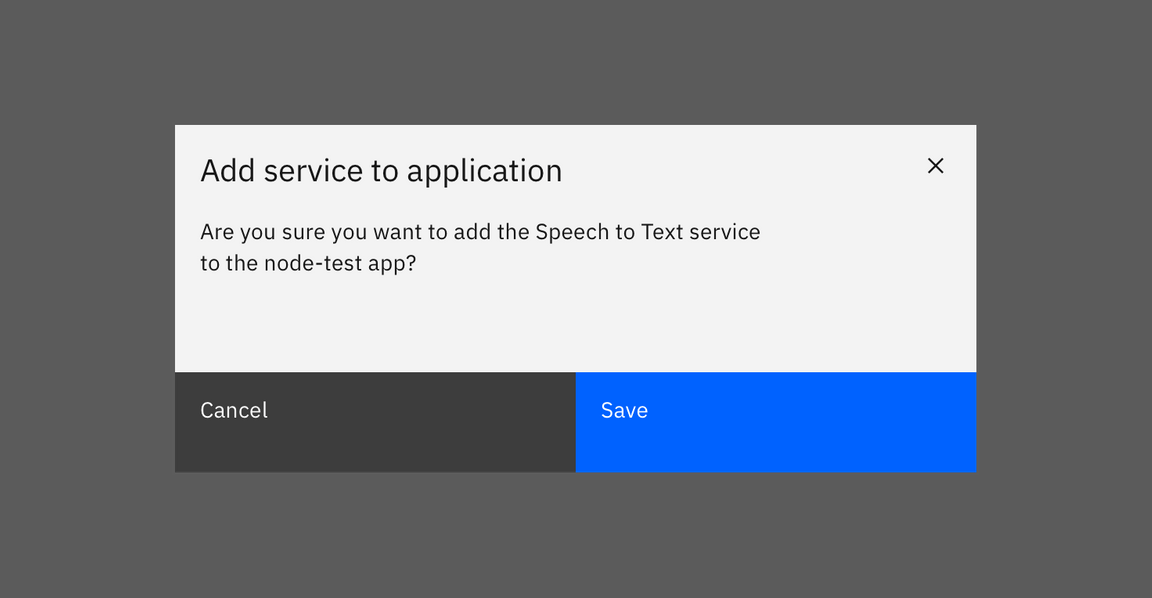
Secondary / Primary button order in a modal
Button alignment
Button alignment depends on where the buttons appear.
- Use full-bleed or full-justified buttons for modals and side panels.
- Use left-justified buttons for forms on their own page (not in a modal or side panel).
- Use right-justified buttons if the primary response advances the user through a multistep configuration such as a wizard.
Modal button alignment
Single buttons or button groups in modals use full-bleed, full-width buttons. Single buttons span the full width of the modal.
Full-width buttons provide significant advantages in time-to-target evaluations using Fitts’ Law, and are increasingly common in other contexts users are likely to encounter.
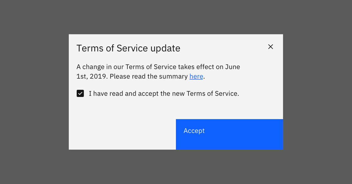
Single primary button in a modal

Secondary / Primary button pair in a modal
If there is a third action, place this within the modal itself as a link, rather than alongside the Secondary / Primary buttons.
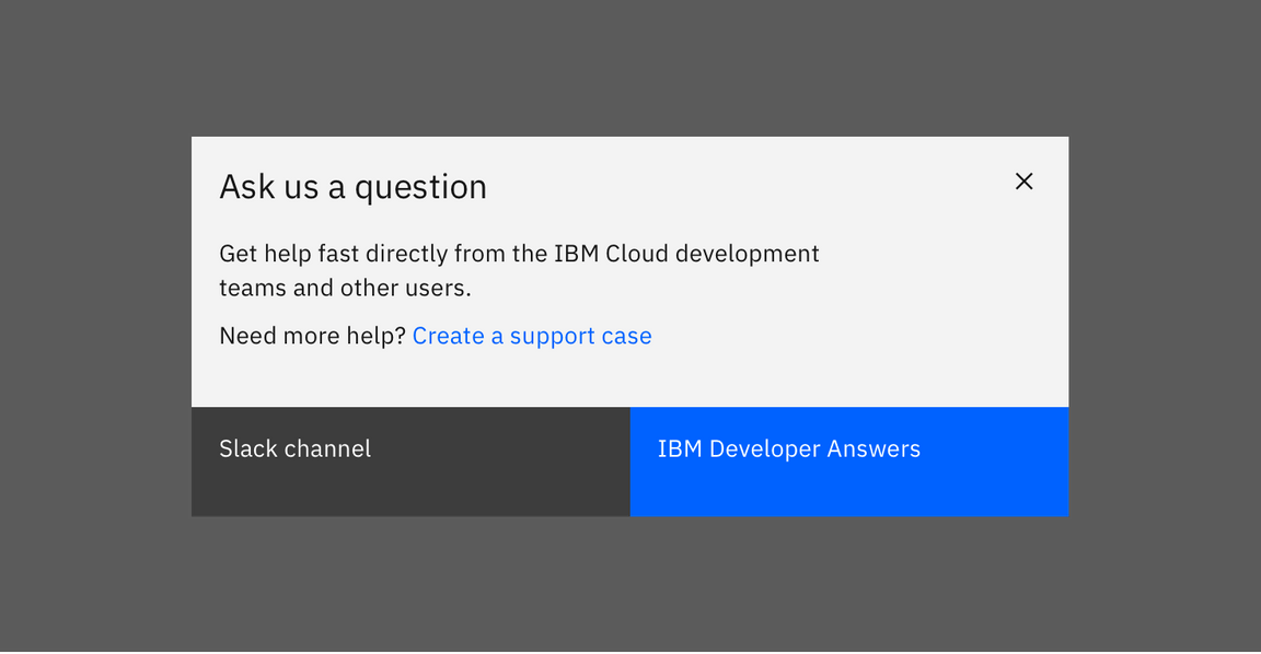
Secondary / Primary button pair with a tertiary action in a modal
Use this same layout for buttons in side panels. Use full-width single buttons or full-width Secondary / Primary button pairs. If there is a third action, considering placing it within the side panel itself, rather than as part of the button group.
Side panel buttons should be visible without scrolling. They should be visible if they’re at the top, the bottom (without scrolling), or sticky and at the bottom of the view if the content is longer than the viewport.
Non-modal forms
On non-modal or in-page forms, align single buttons or Secondary / Primary button groups to the left. Buttons should align with the form controls regardless of the user‘s window width.
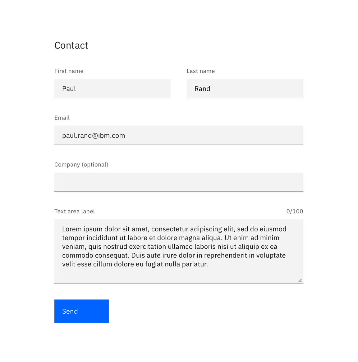
Single button alignment in forms
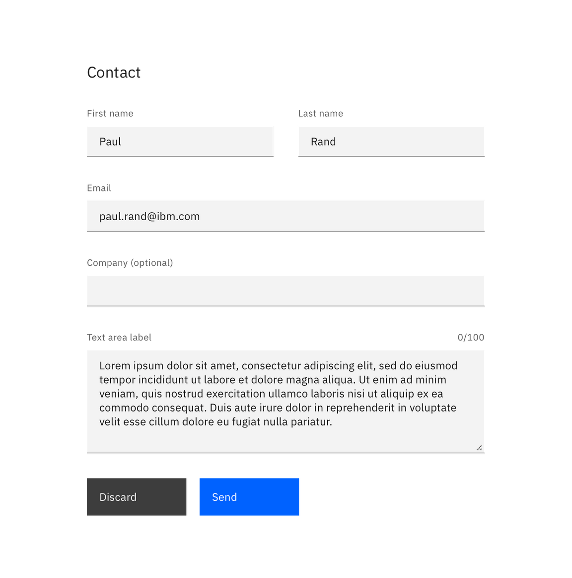
Secondary / Primary button alignment in forms
Multistep forms
When the primary action implies a navigation step forward, as in a wizard, align single buttons or Secondary/Primary button groups to the right. This position conveys the “next step” intention.
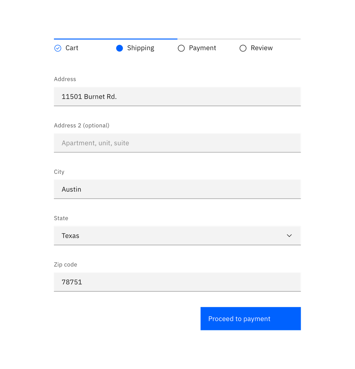
Single button alignment in a wizard
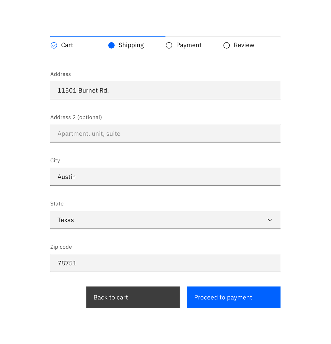
Secondary / Primary button pair alignment in a wizard
Labels
Button labels should clearly indicate the action of the button. Use active verbs, such as Add or Delete. Use sentence-style capitalization (only the first word in a phrase and any proper nouns capitalized) and no more than three words for button labels.
For sets of buttons, use specific labels, such as Save or Discard, instead of using OK and Cancel. This is particularly helpful when the user is confirming an action.
For consistency, see labels and idioms for the approved list of action labels.
Icon usage
- Use glyphs (16px) within buttons.
- Glyphs are distinguished by their solid shape and knocked-out details.
- Glyphs should always appear to the right of the text.
- Glyphs used in buttons must be directly related to the action that the user is taking.
- Glyphs must be the same color value as the text within a button.
- Ghost buttons require a glyph icon.

Glyph usage in buttons
Danger button usage
Danger buttons have a different visual style to inform users of potentially destructive actions they are about to take. If using the danger button as a standalone, we recommend styling it as a secondary button. Within a set, the danger button should be styled as a primary button.
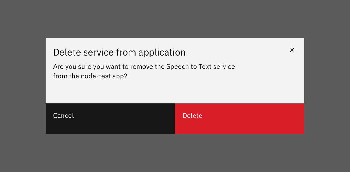
Danger button set
Variations
| Button type | Purpose |
|---|---|
| Primary | For the principal call to action on the page. |
| Secondary | For secondary actions on each page. |
| Button with icon | When words are not enough, icons can be used in buttons to better communicate what the button does. Icons are always paired with text. |
| Disabled button | Use when the user cannot proceed until an input is collected. |
| Set of buttons | When an action required by the user has more than one option, always use a a negative action button (secondary) paired with a positive action button (primary) in that order. Negative action buttons will be on the left; positive action buttons on the right. When these two types of buttons are paired in the correct order, they will automatically space themselves apart. |
| Small button | Use when there is not enough vertical space for a regular sized button. |
| Ghost button | When an action does not require primary dominance on the page. |
| Danger button | When an action has potentially destructive effects on the user‘s data (delete, remove, etc). |
References
- Jakob Nielsen, OK-Cancel or Cancel-OK? The Trouble With Buttons (2008)
- The Interaction Design Foundation, The Glossary of Human Computer Interaction, Chapter 37
Feedback
Help us improve this component by providing feedback, asking questions, and leaving any other comments on GitHub.